Lancashire based Interior designers bringing space to life
On Wednesday 23rd September, Ria took a trip to London to visit 100% Design. The exhibition takes place each year and is one of our favourites to visit. Why go to 100% Design? We go to see the variety and quality of exhibitors, who are all under one roof at London’s Olympia. The sheer scale of the exhibition space enables similar suppliers to showcase side-by-side, adding pressure on exhibitors to ‘stand out’. What we love about 100% is the fact that the stand designs become as important as the products being showcased.
The show boasts new products from hundreds of exhibitors across Interiors, Design and Build, Workplace, Kitchens and Bathrooms as well as Emerging Brands. Ria has put together her own highlights from the exhibition, take a look:
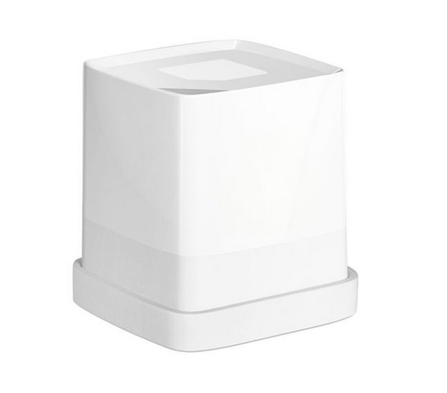
Cube it?
Part of our design role is to source colours and finishes for clients’ projects. We often find colours we like within an interior space, in a magazine or even on things in the office, like a new cup! We then have the headache of trying to find the colour and matching it to CMYK/RGB/Pantone etc. You can imagine how excited we were to find a gadget at 100% design called The Cube – it captures the colour off any surface and wirelessly translates the exact colour match to your smart phone. We are definitely going to get one of these for the office. The Cube is from www.palette.com.
 Tiles, tiles and more tiles!
We love the wide variety of patterns and statement tiles around at the moment. You will find loads of geometric shapes and patterns of all kinds. Here are a few that stood out for us…
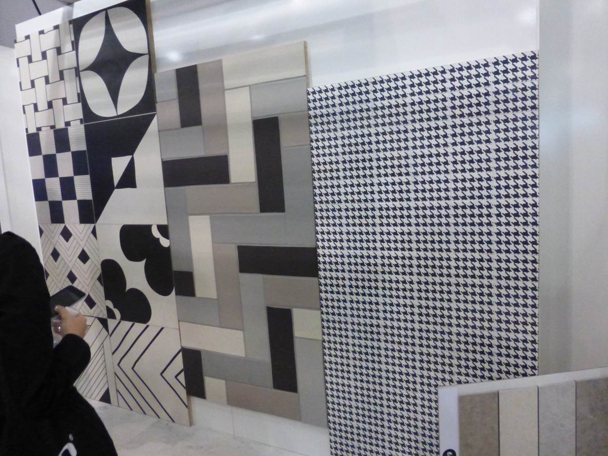 Worlds End Tiles www.worldsendtiles.co.uk
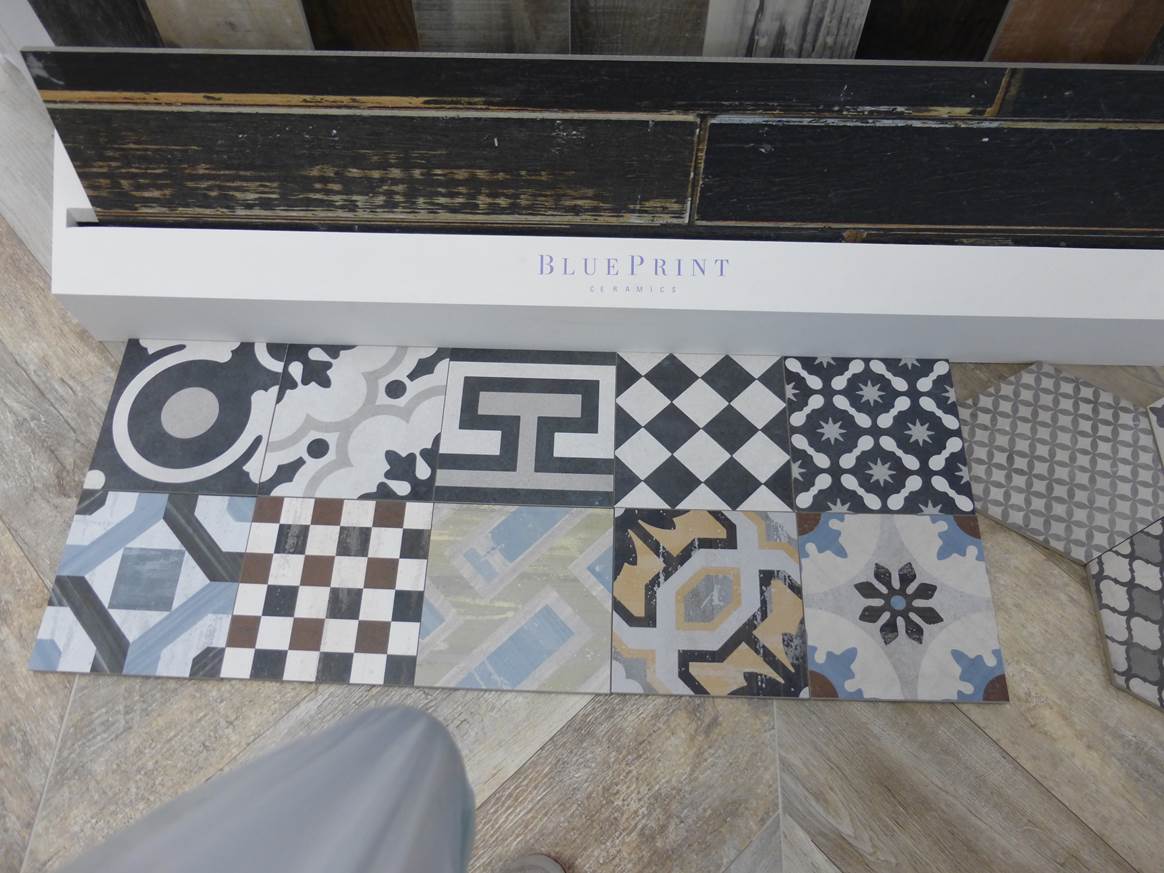 Blue Print Ceramics www.blueprintceramics.com
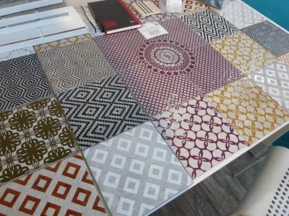 Bedrock www.bedrock-tiles.com/home
Is that wood?
Who needs timber cladding to create a statement wall when you can get a Faux Texture that looks the exact same! This wallpaper product looks just like the real thing and is cheaper, less maintenance and there is a wide choice of looks available. We have photographed a couple of our favourites to show you how effective they are.
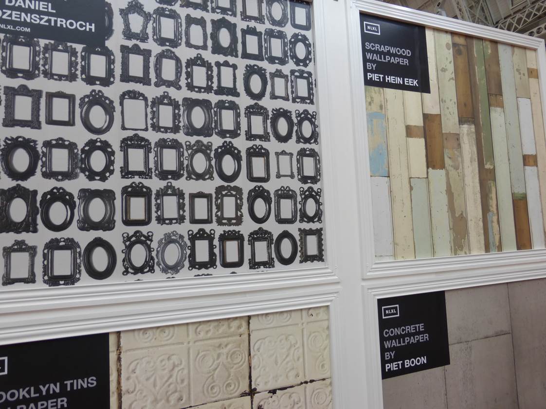 NLXL http://usa.nlxl.com
Let’s shine
As always at 100% Design there are lots of amazing lights in various colours and styles. We found a lot of copper tones and industrial-style lights. Not only were the lights eye catching but the lighting exhibitors really know how to present their products so that they stand out. We loved the packing crate idea to promote the collection from Mullan.
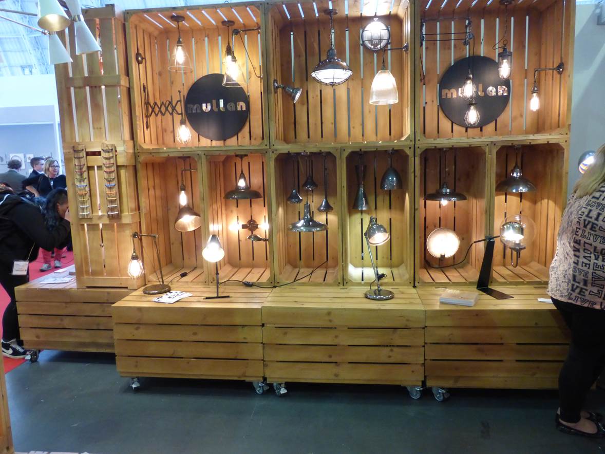 Mullan www.mullanlighting.com
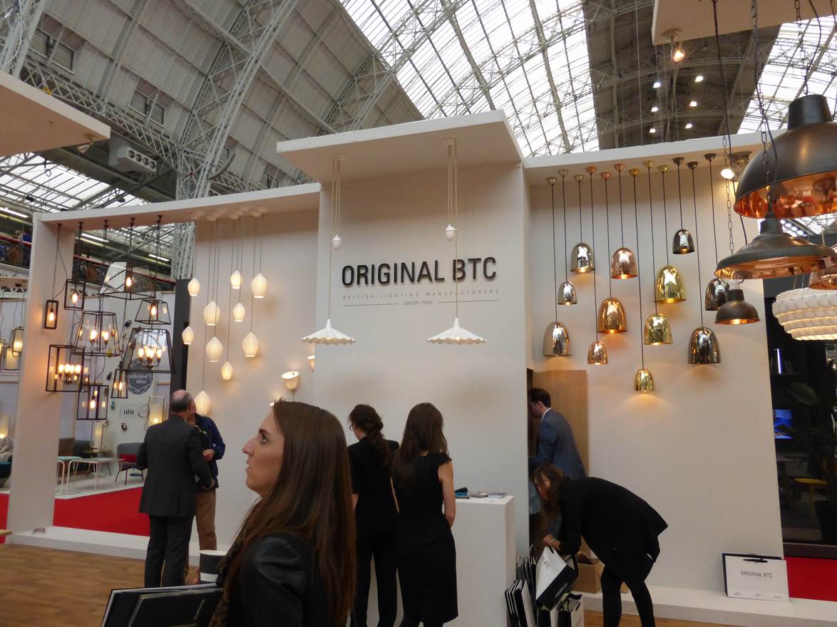 Original BTC www.originalbtc.com
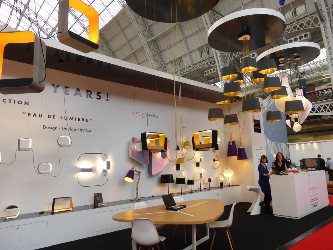 Design Heure http://www.designheure.com/?lang=en
Say what?
There was lots of creative acoustic panelling around this year using felt! Just look at the designs and textures that can be created using this amazingly flexible material, as well as providing acoustic qualities.
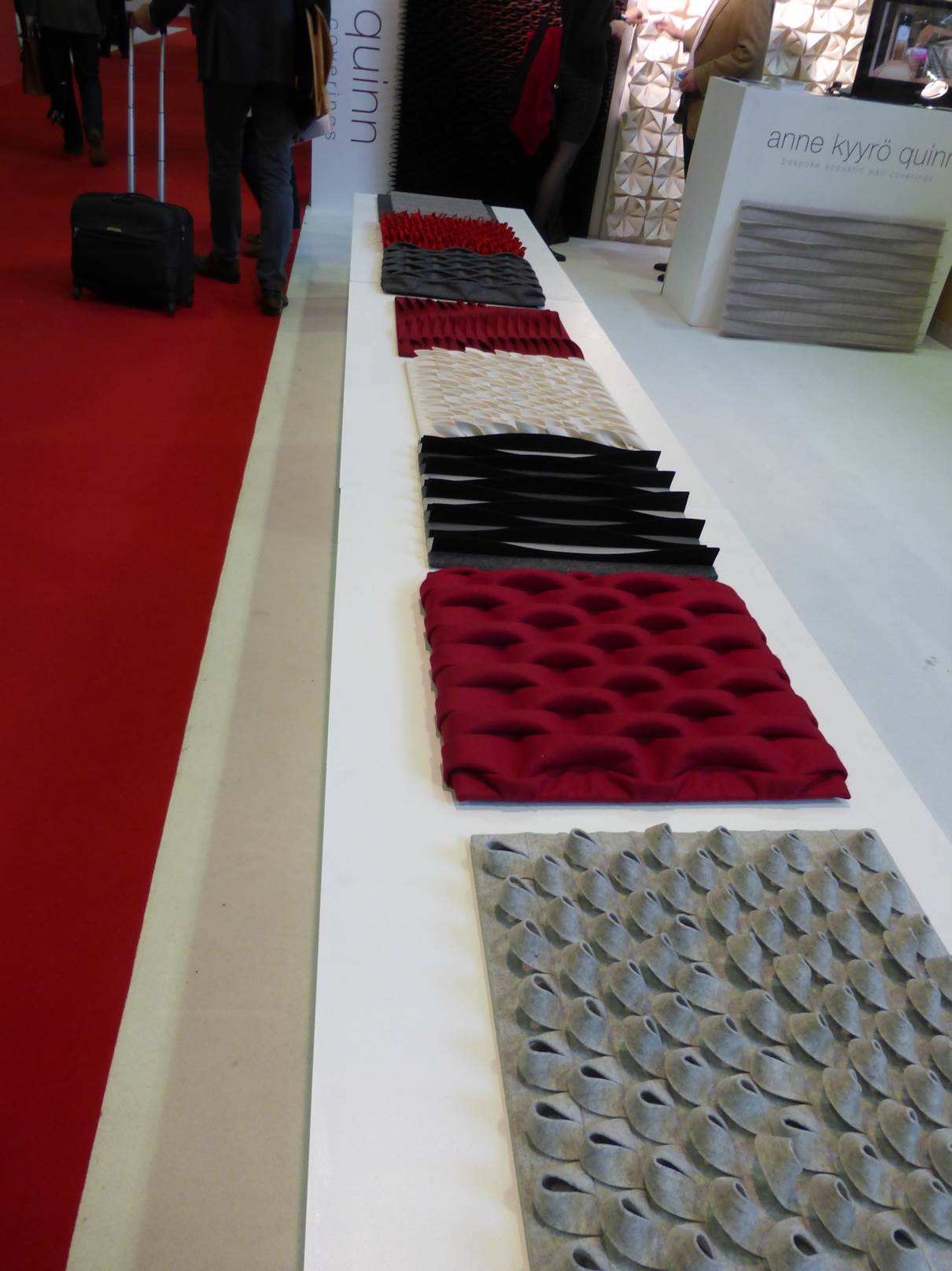 Anne Kyro Quinn www.annekyyroquinn.com
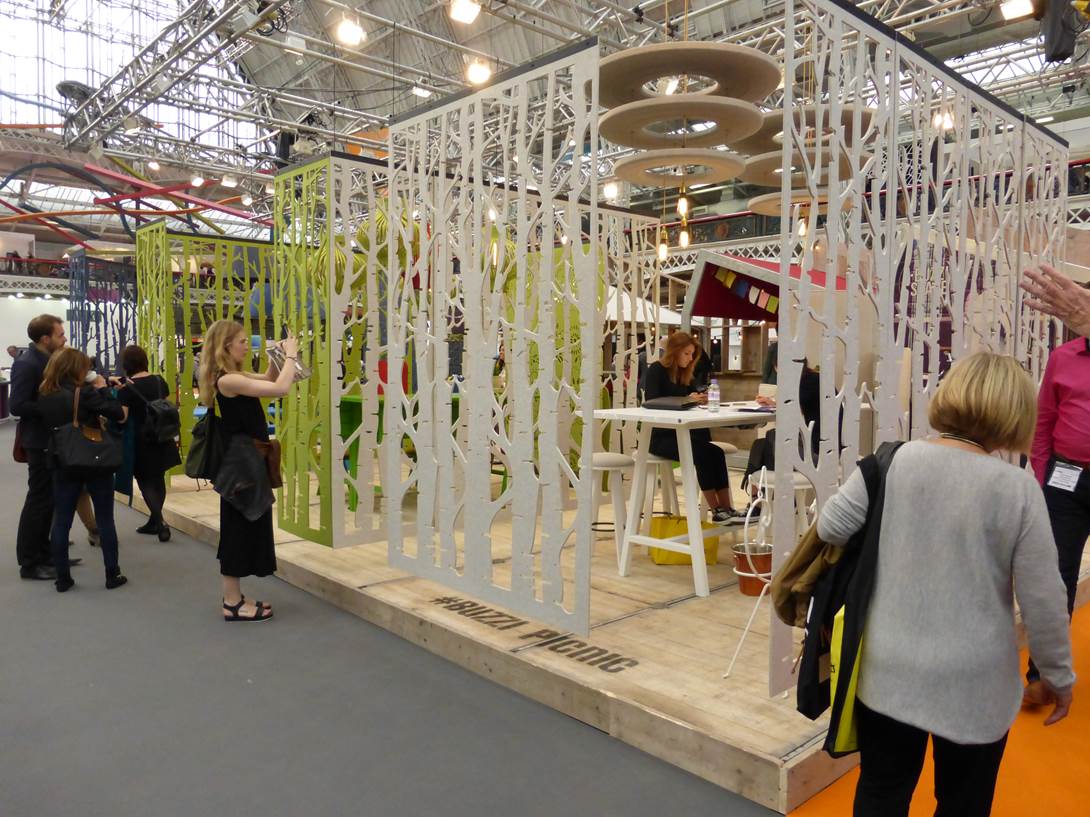
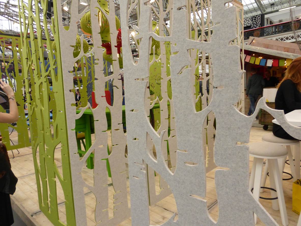 Buzzi http://buzzi.space/
Stand-out-stands designs
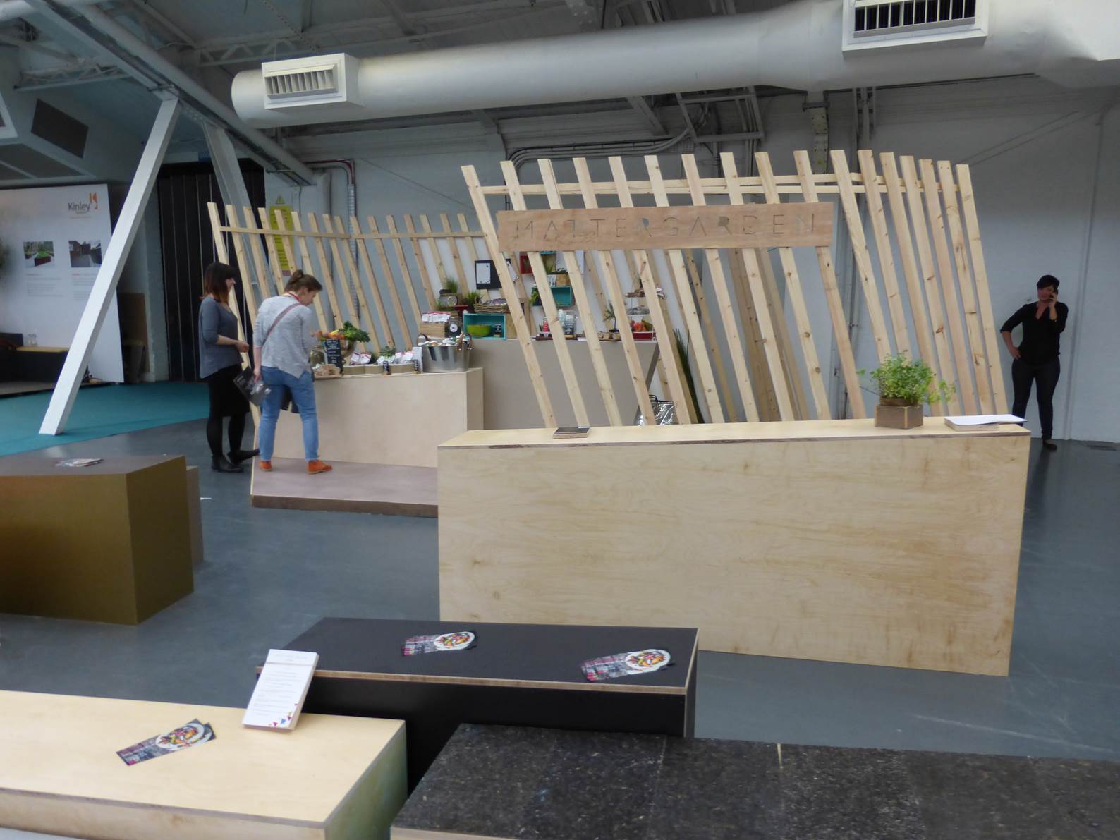
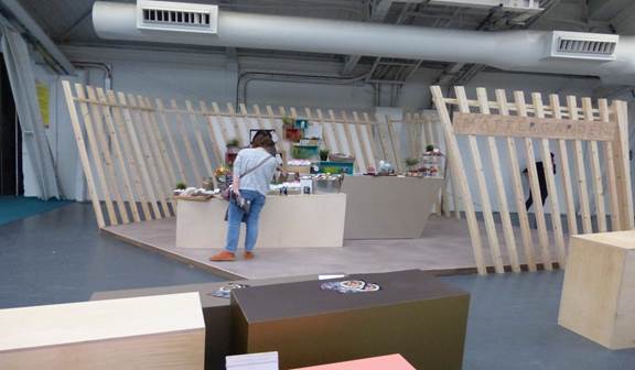
We are always impressed at 100% with the stands themselves. Not only do we go to check out the products but we love checking out the stands too. Here are some of Ria’s ‘stand-out-stands’.
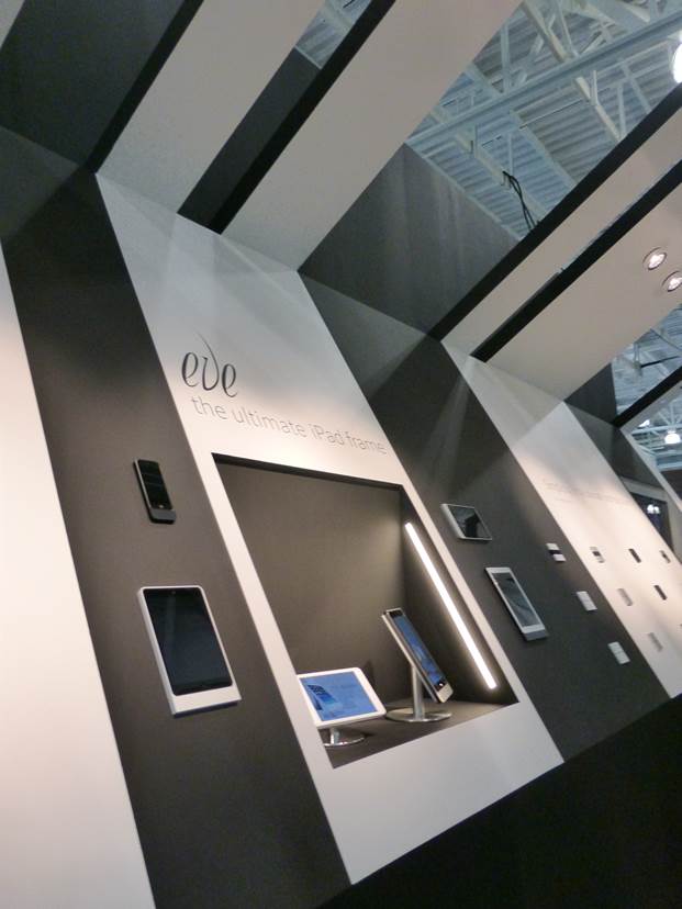
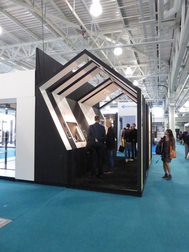 Most Striking- basalte http://www.basalte.be/en
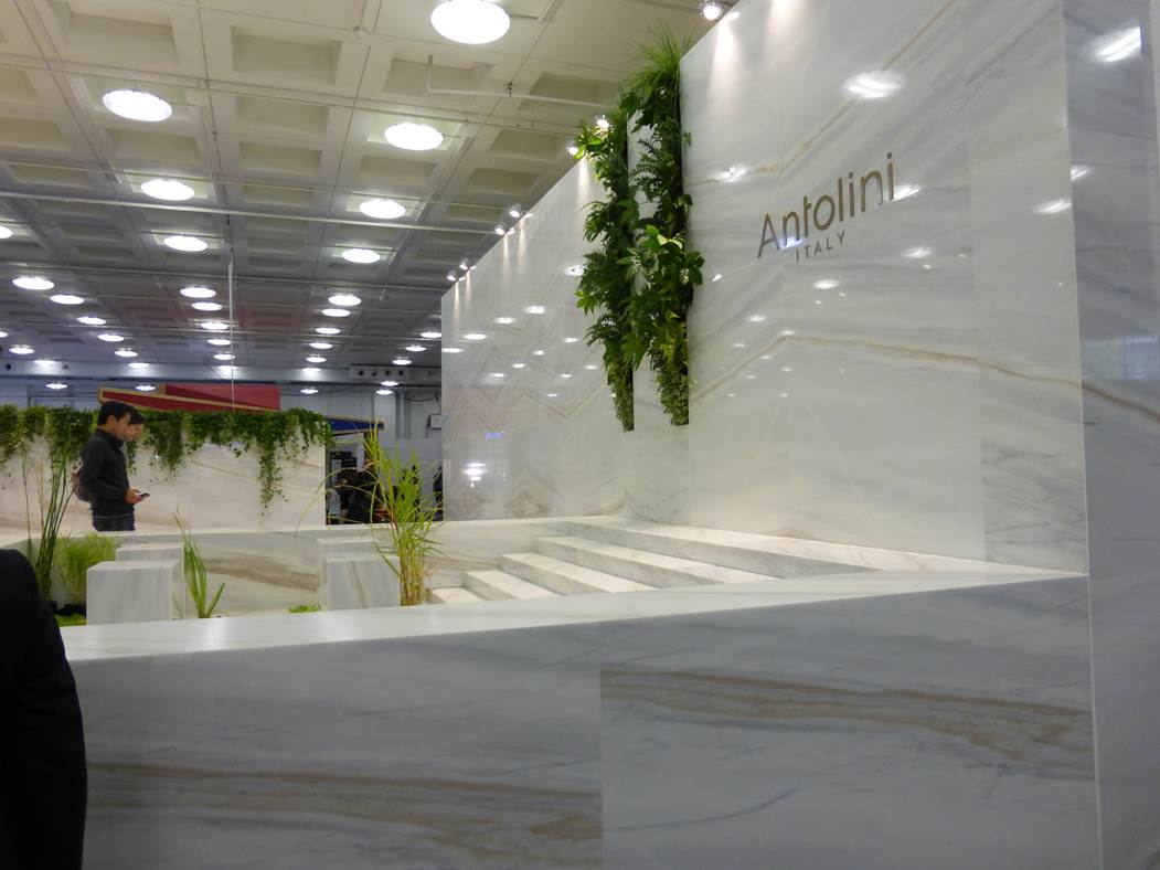
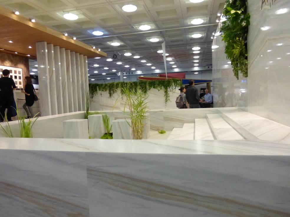 Most Expensive – Antolini http://www.antolini.com/en/home
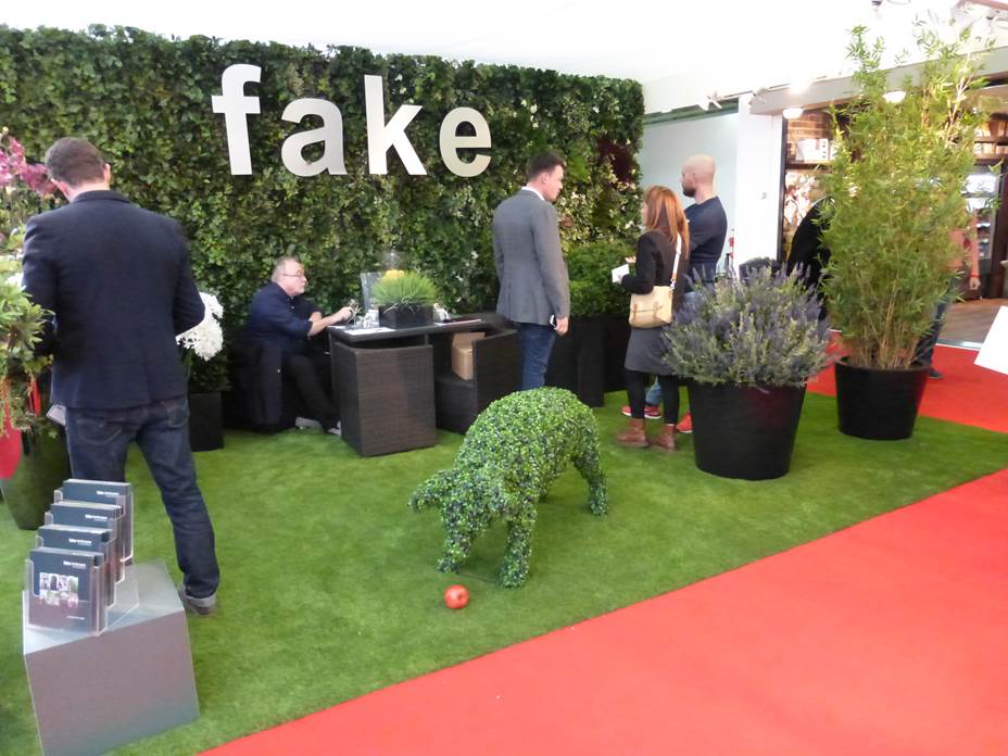 Most Wacky – Fake www.fake.com
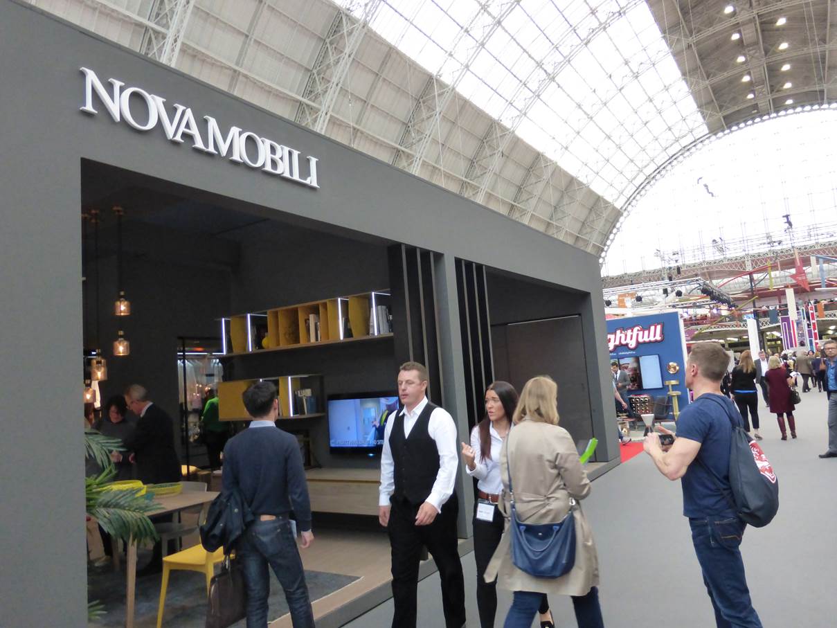
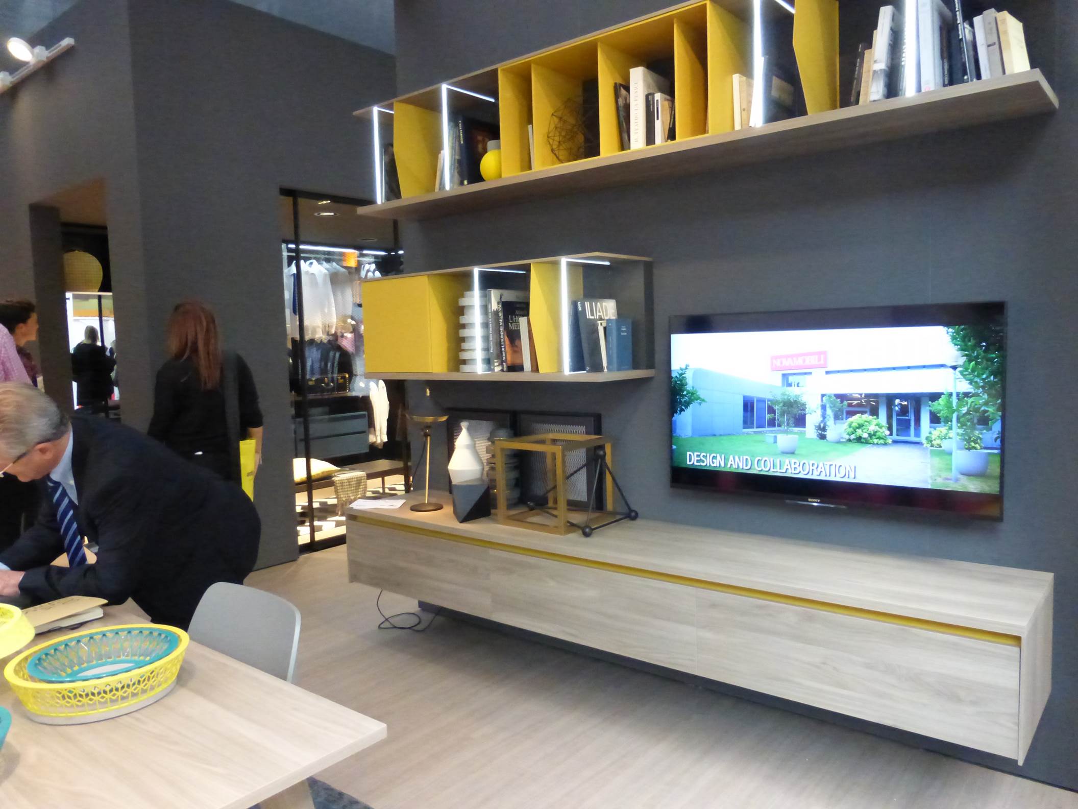 Most interactive – Novamobili http://www.novamobili.it/ita/
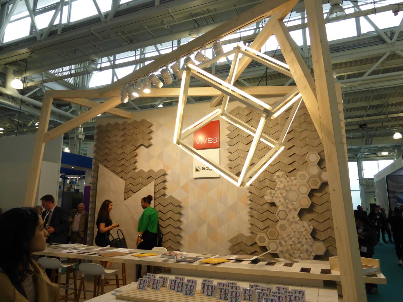 Most Quirky – Vives www.vivesceramica.com
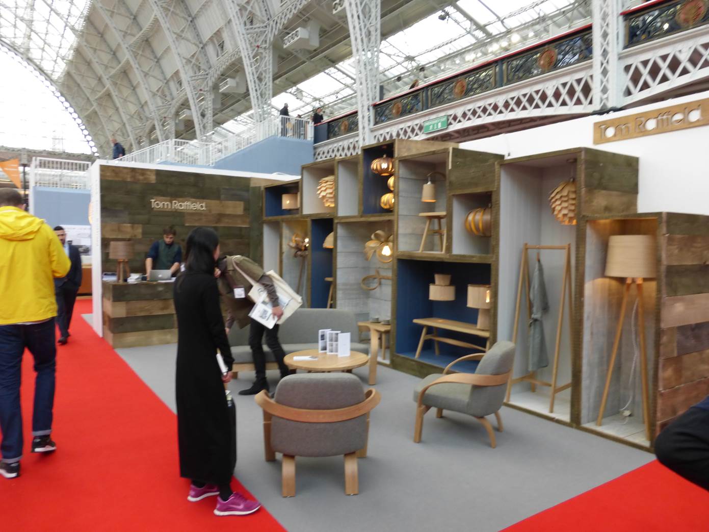 All about the timber – Tom Raffield www.tomraffield.com
Did you go? Which were your favourite?
